MY_WTC #22 | Jimmac 1993

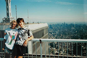
1993 was the year I first happen to leave the post communist Czechoslovakia and visit the United States for the first time. Spent most of time in New Hampshire and only managed to do a short trip to Boston, Washington DC and NYC.

While Empire State was impressive for a small town boy from a ruined centrally planned economy, going up the WTC was a total science fiction. Seeing the Big apple from there is unforgettable.

The girl on the left of me is Margriet, and we’re photographed by her boyfriend Bob. I haven’t heard from the two Dutch folks for at least 15 years. Would love to get in touch :)
Teile deine Gedanken

Teile deine Gedanken

Select one of the portfolio styles.
Note: If you change the portfolio item type, you must click Update/Publish button in order to view item specific options.

Set the alignment of description block that contains item details.

Set the description width (columns) to occupy in item page.

Set placement for gallery images.

Stick gallery photos to the top of page.

Make description container sticky when scrolling down the page.

Enable this option if you want to use masonry layout for gallery items which helps ordering the images, leaving no extra gaps.

One line title to describe the item (optional).

Enable custom navigation (prev/next) links for this portfolio item.

Set custom "previous" link for this portfolio item. (Optional)

Set custom "next" link for this portfolio item. (Optional)

Enter custom URL to replace the default portfolio archive URL (Optional)

Usually written "Launch website"

Website when users click in Launch Link (if not given will not be visible to the user).
Hint: If you want to disable clicking for this item, just type # in this field, and select Redirect to Link URL (Project URL) value in Item Linking.

Open in new tab or window when user clicks in link.

Apart from default item single page you can send users to the external source url (optional)

Add custom checklists for example the services you have finished, tasks done, etc.

1

Title to describe the checklist items.

Enter one task per line, as many as you want.

Select columns per row for this checklist entry.

Choose the effect to show the item images when they appear in viewport.

You can either set default image spacing or remove it (merge images).

Set image captions position for gallery images.

px

Select all images you want to show for this portfolio item.

Klicke "Add New" zum Erstellen des Layouts
0 Image

Image that will be shown

Enter a predefined image size

Columns for image relative to container

0 Images Slider

Enter a predefined image size

Set the number of seconds to auto rotate the images

Columns for image relative to container

0 Comparison Images

Assign first image to compare (after)

Assign second image to compare (before)

Enter a predefined image size

Columns for image relative to container

0 YouTube Video

Enter YouTube video URL

Default is used 16:9

You can assign video thumbnail (optional)

Start playing video when page loads

Replay video over and over

Columns for image relative to container

0 Vimeo Video

Enter Vimeo video URL

Default is used 16:9

Start playing video when page loads

Replay video over and over

Columns for image relative to container

0 Self-Hosted Video

Upload your own video or select from gallery

Dateiname:

Dateigröße:

Default is used 16:9

You can assign video thumbnail (optional)

Start playing video when page loads

Replay video over and over

Columns for image relative to container

0 Text Quote

Enter the quote text to display in portfolio gallery

You may or may not include author name for this quote

Columns for image relative to container

0 HTML

You can also use shortcodes in this field

Columns for image relative to container

Assign self hosted video as featured video of this portfolio item. Adding featured video will replace Featured Image.

Select MP4, OGG or WEBM file types.

Dateiname:

Dateigröße:

If set to autoplay, video will be muted and auto play when visible on viewport.

Toggle audio output of the video. If "Autoplay" is on, the video will be muted automatically.

Show video controls such as play button, volume control and progress bar. If checked, hover layer will not be shown.

Loop video infinitely.

Set header position (logo and menu).

If Header Position is set to "Over the Content" this setting will take effect. Unit is Pixels

px

Extend header container to the browser edge.

Apply custom header styling for this page.

Empty settings will be ignored.

PX
PX
PX

Show or hide page heading title. Note that this setting may not be supported for some pages.

Use this post title or shown your custom title.

Enter your custom page heading title

Use post content as description or enter custom description.

Enter your custom page heading description here. (Optional)

Use custom logo for this page only.

You can the set maximum width in pixels for the uploaded logo, mostly used when you use upload retina (@2x) logo. (Optional)

px

You can enable or disable sticky header on this page only.

Use custom logo for sticky header in this page only.

Empty settings will be ignored.

PX
PX
PX
PX
PX
PX
PX

Switch header logo and styles on specific sections or sliders.

Switch logo and header style on specific sections or slider of page.

1

Target to HTML element

#

Specify slide index to apply the header style. Leave blank to apply for all slides.

Upload custom logo for this section/slide

Optional

Set transparent header style

Show or hide footer on this specific page.

You can overwrite the footer type for this page/post only.

Set custom container width for this page.

Set maximum container width.

PX

Checking this option will overwrite container width value.

Override breadcrumb settings for this current page. Breadcrumb NavXT plugin must be installed and active.

Set custom background color. Leave empty to inherit the value from Theme Options.

Set custom text color. Leave empty to inherit the value from Theme Options.

Set custom border color. Leave empty to inherit the value from Theme Options.

Set custom border type. Leave empty to inherit the value from Theme Options.

Set custom border radius (optional).

px

Set custom top margin (optional).

px

Set custom bottom margin (optional).

px

Set text alignment of breadcrumb trail.

You can set custom layer hover color for this portfolio item specifically. (Optional)

Set hover effect style for this item only. (Optional)

Set initial state for hover layer. (Optional)

Apply custom CSS only for this page.
Note: You don't need to wrap it with style tags (HTML is not allowed in this field).